

‘How would you rate the seminar you have just finished?’ Underneath sit five boxes, ‘very poor’ at one end and ‘very good’ at the other. Almost every questionnaire contains a row of boxes like that, and the format has a name.
A rating scale is a graded answer format on which a respondent shows how strongly a characteristic applies to them. Several steps sit between two ends, usually five to seven, and each step stands for one degree of a judgement that cannot be observed directly. By the end of this article you will know how many points your scale needs, how to label them and which figure you may report.
📌 Key points at a glance
- Degrees, not yes or no: that is the whole point.
- Five to seven points suit most questionnaires.
- Words on every box beat numbers in the gaps.
- Ordinal level is what a single rating scale delivers.
- Park ‘don’t know’ below the scale, not inside it.
Create a survey for free
With empirio.ai you can create a modern online survey in minutes — with hosting in the EU.
- AI-built survey
- Adjust by drag & drop
- Real-time analysis
What is a rating scale?
Any rating scale offers several graded categories in a fixed order, so that somebody can say not merely whether something applies but how strongly, running for instance from ‘very dissatisfied’ to ‘very satisfied’. Questionnaire guides also call it a rating item, a rating question or, in customer research, a satisfaction scale.
Everything hangs on the gradation. A plain yes or no sorts people into two camps and stops there, whereas a graded answer shows how far towards one end each person sits. Among the question types you can put in a questionnaire, that is what makes the rating scale the default for attitudes, satisfaction and self-assessment.
Two roles exist for the same format. Under self-assessment somebody rates their own state, say their confidence about statistics before a module starts. Under observer rating a second person does the judging, say a placement supervisor marking punctuality at the end of term. Identical on paper, the two go wrong in completely different ways.
What a rating scale captures is not the thing itself but the reading somebody takes of it.
Finance borrows the same term, which is why search results mix the two. A rating scale there is the ladder of creditworthiness that agencies use to grade borrowers, and none of what follows applies to it. What this article covers is the answer format you meet in an online survey or on a printed questionnaire.
What level of measurement does a rating scale have?
Ordinal is the honest answer. Order is clear, so ‘often’ sits above ‘sometimes’, yet nothing shows that the gap between ‘never’ and ‘rarely’ matches the gap between ‘often’ and ‘always’.
Official British statistics work around that rather than ignore it. The personal wellbeing standard used across government asks four questions on an eleven point scale and reports them in named bands rather than as bare points: 0 to 4 low, 5 to 6 medium, 7 to 8 high, 9 to 10 very high (Government Analysis Function, personal wellbeing harmonised standard). Grouping like that keeps the claim inside what an ordinal measurement can carry.
Every Likert scale is a rating scale, not the reverse
The Likert scale is a particular build of rating scale rather than a rival format. Three features mark it out: an agreement continuum, several statements about one construct and a single combined score. One such question on its own is a Likert type item, and it does not leave ordinal territory. What else the build demands is set out in our guide to the Likert scale.
Practice does something else with a score pooled from several items and handles it like an interval scale. Summing does not lift the level of measurement, and no textbook pretends otherwise. The argument is a practical one: a pooled score has many possible values, and the usual procedures have proved robust against this particular violation. Assumption, not arithmetic.
For your methods chapter
Averaging response steps puts you one sentence in debt, so pay it: state that the steps were treated as equidistant. A single line heads off the obvious question at a viva. Leave it out and the analysis is claiming a level of measurement the data never had.
Which types of rating scale are there?
Length is only one of the things that separates one rating scale from another. Three design questions describe the rest: which direction the scale runs in, what its points are marked with and how finely somebody may answer.
How you settle them decides a good part of your data quality. Two opposing ends with words only at those ends ask something different of a respondent than five boxes each carrying a word of its own.
Unipolar or bipolar: one direction or two
Examples deserve a caveat first. Polarity is not defined consistently in the methods literature, as the GESIS Survey Guidelines note for agreement scales, so a dissertation calling a scale unipolar or bipolar does well to say which definition it follows.
Unipolar scales measure how much of one characteristic is present, from none at all to a great deal. ‘How demanding did you find the reading list for this module?’ running from ‘not at all demanding’ up to ‘extremely demanding’ is unipolar, and nothing sits opposite it.
Bipolar scales put two opposites at the ends. ‘The atmosphere at our club nights felt …’ with steps from ‘very cliquey’ through a middle to ‘very welcoming’ is bipolar. Each end defines the other, and the middle has to carry a meaning of its own.
What goes on the boxes: words, figures or symbols
Whatever sits on the boxes is the part respondents actually read, and four kinds are in common use. Choosing between them is not decoration: the mark decides whether somebody has to interpret the scale before answering, and every interpretation is a chance for two people to read one box differently.
| Kind of mark | On the page | Best used for |
|---|---|---|
| Verbal | a word on every box | the safe default |
| Numeric | figures, say 1 to 7 | ladders people already know |
| Symbolic | stars or smiley faces | children, quick feedback |
| Graphic | a mark along a line | fine gradations on screen |
Figures seem self-explanatory and frequently are not, and England offers a sharp demonstration of why. Reformed GCSEs are graded on a scale of 9 to 1 with 9 as the top grade, as the government sets out in its guidance on GCSE reform, and Ofqual describes the same scale running from 9, the highest grade, to 1, the lowest, in place of the older letters A* to G (Ofqual, a brief guide for parents). One country, one school career, two ladders pointing opposite ways on the page. In Germany the figures run the other way, with 1 the best mark and 6 the worst. Put a bare 1 to 7 in front of both audiences and you collect two different measurements.
Boxes or a slider
Fixed steps are the norm: a given number of boxes and nothing between them, on paper as on screen. A continuous scale replaces them with a slider or a line, letting any position be chosen, which is the idea medicine uses as the visual analogue scale for pain. Workable online, hopeless on paper, where somebody would have to come along afterwards with a ruler.
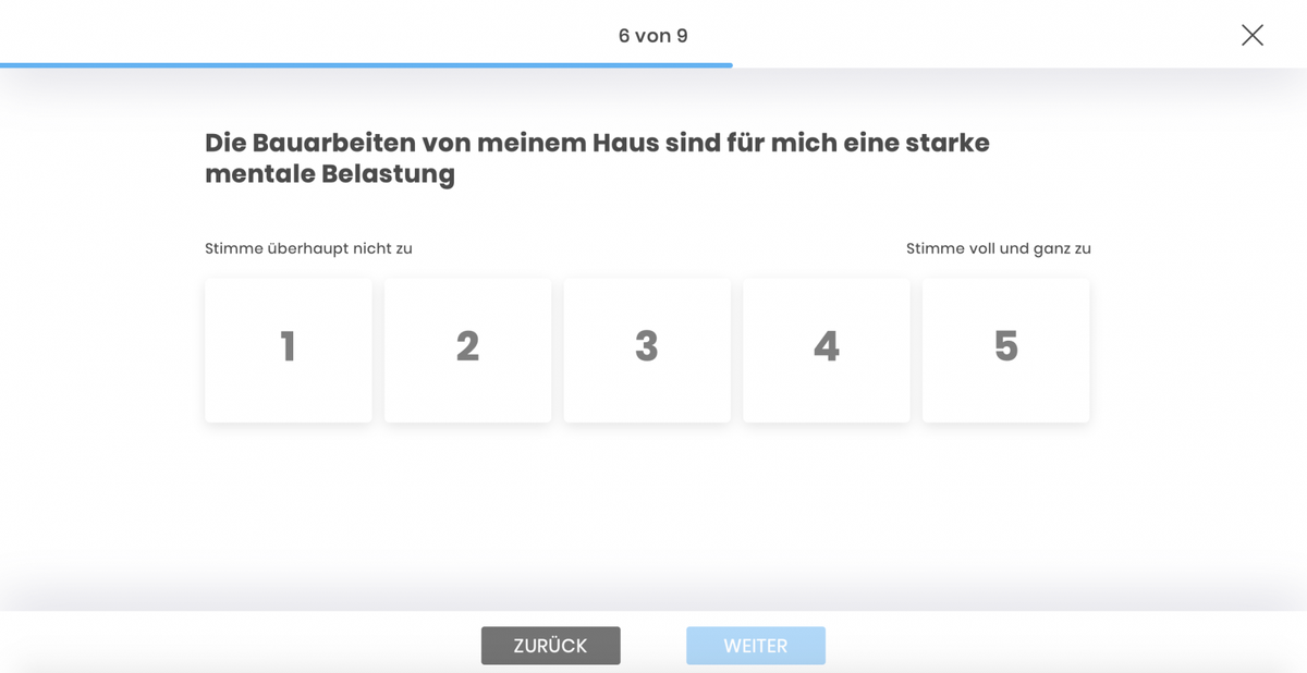
How many points should a rating scale have?
Five to seven points is the working rule. The German GESIS Survey Guidelines put the optimum for reliability, validity and fineness of distinction in that range and note that respondents prefer it too (Menold and Bogner 2016). British government guidance agrees and recommends at least five points, with seven giving more detail.
Research has not closed the question, though. The same GESIS paper points to newer work in which measurement quality keeps improving as categories are added, tested as far as 10, 11 and even 100 steps. Five to seven has won on practical grounds as much as on evidence: beyond seven a scale can barely be put into words.
Should your scale have a middle at all?
Odd counts give you a middle, even counts take it away, and either is defensible. The decision rests on whether a middle position exists in your subject at all. ‘How satisfied are you with the library opening hours?’ allows genuine indecision, while ‘Would you recommend this module to a friend?’ mostly does not.
British and German guidance differ in how firmly they answer. The Government Analysis Function guidance states flatly that a scale of this kind should always include a neutral option in the middle. GESIS hedges and reports only that most researchers advise offering one, since without it genuinely neutral respondents drift to a neighbouring point and tilt the result towards a position nobody held. The price is a pull to the centre, which comes up further down.
Eleven points and a small screen
Scale length stops being only a measurement question once a survey runs on phones. The personal wellbeing standard uses 0 to 10, and its guidance warns against showing a visual 0 to 10 scale online, because screen sizes differ and a laptop may show the whole scale where a phone shows only the first few options. For the Opinions and Lifestyle Survey the Office for National Statistics switched to a free text box instead.
Mind the don’t know option
‘Don’t know’ and ‘prefer not to say’ are not points on the scale and never belong in the middle. Their place is at the end of the answer list, set apart, and in the analysis they count as missing values, as the Government Analysis Function guidance recommends. Whether to offer one at all depends on topic, mode and audience, and GESIS points to work by Sturgis and colleagues showing that respondents otherwise use the middle category as a substitute.
Create a survey for free
With empirio.ai you can create a modern online survey in minutes — with hosting in the EU.
- AI-built survey
- Adjust by drag & drop
- Real-time analysis
Labelling the points: wording you can lift
Put a word on every point, not only on the two ends. Reliability and validity both rise when a scale is fully verbalised, respondents prefer it that way, and the GESIS Survey Guidelines record the biggest gain among people with less formal education. Numbers alone leave every respondent to invent a private meaning for the boxes in between.
Four conditions make a set of step words usable: precision, a symmetrical spread with as many positive as negative points, plain comprehensibility and gaps that feel even to the reader. That last condition is the hard one, and it is the one that does not survive translation. Bernd Rohrmann calibrated German step words empirically in 1978, and those lists are worth nothing in English: a spacing measured for one language is not the same spacing in another. Translating a calibrated scale throws away the calibration and keeps the appearance.
Ready made British wording for five points
English needs no translation here, because the Government Analysis Function, whose central team sits at the Office for National Statistics, publishes worked response scales in its questionnaire design guidance. Five of them are ready to lift straight into a questionnaire, and every one of them labels all five points.
- Agreement: strongly agree, agree, neither agree nor disagree, disagree, strongly disagree
- Satisfaction: highly satisfied, satisfied, neither satisfied nor dissatisfied, dissatisfied, highly dissatisfied
- Frequency: always, often, sometimes, rarely, never
- Likelihood: very likely, likely, neither likely nor not likely, unlikely, very unlikely
- Support: strongly favour, somewhat favour, neither favour nor oppose, somewhat oppose, strongly oppose
Two cautions come with the list. Convention is what these wordings are, not measured spacing, so lifting them does not make your steps equidistant. The same guidance asks you to keep a scale in the same order across a questionnaire, and adds a reminder that lands harder than any statistic: the average reading age in the UK is nine years old.
Ask about the thing, not about agreement
Rather than ‘I use surveys often’ with an agreement scale, ask ‘How often do you use surveys?’ with the frequency wording above. GESIS advises against agreement scales because they produce higher agreement than scales asking about the characteristic itself. The Analysis Function guidance adds a second habit worth copying: balance the question, as in ‘How useful, or not useful, did you find this presentation?’
Analysing a rating scale: which figure you may report
Frequencies come first, meaning the count sitting on every single point. No level of measurement forbids that table, and it shows precisely what a summary figure swallows.
Take a village hall surveying its hirers about bookings. Sixty people answer on a five point satisfaction scale and the raw counts already tell most of the story.
| Answer option | Replies | Share |
|---|---|---|
| Highly dissatisfied | 4 | 7 per cent |
| Dissatisfied | 7 | 12 per cent |
| Neither satisfied nor dissatisfied | 11 | 18 per cent |
| Satisfied | 23 | 38 per cent |
| Highly satisfied | 15 | 25 per cent |
| Total | 60 | 100 per cent |
Median and mode both land on ‘satisfied’. Scoring the points 1 to 5 gives a mean of 3.6 and the two top boxes come to 63 per cent. Quote the 3.6 alone and the eleven people in the middle vanish, along with the eleven who were dissatisfied.
Which figure fits depends on one question: single item or scale score? Single items are best summarised by the median, which assumes only a rank order. A score pooled from several items about one construct takes a mean, so long as the methods chapter names equidistance as the assumption it is. Where description ends and inference begins is covered in our guide to descriptive and inferential statistics.
Top two box: one number, less information
Reports everywhere squash the two most positive points into a single percentage, and the net promoter score is the best known figure built that way. Nothing is wrong with it, except that 63 per cent hides whether the approval was enthusiastic or grudging. Anybody quoting one owes the reader the full table somewhere, and the same goes when you measure satisfaction across a team.
Common mistakes with rating scales
Wording is where most of the damage happens, not analysis. Response tendencies are what survey research calls the habit of shifting answers in a fixed direction regardless of what a question asks. Not every respondent does it, but among those who do the shift runs the same way, which is why it does not average itself out.
GESIS gathers four well documented patterns in its guidelines on response tendencies (Bogner and Landrock 2016). No sample size cures any of the four. A better questionnaire cures all of them.
The pull towards the middle flattens your result
Middling answers cost less effort than a decision, so a share of respondents park there regardless of content. Distributions then look more balanced than the attitudes behind them really are. Labelling every point helps, and where a middle position makes no sense in the subject matter, an even number of points is the simplest fix.
Acquiescence turns every statement into a yes
Acquiescence is the habit of agreeing with statements whatever they say, ticking agree or yes right down the page. GESIS names only one genuinely effective remedy, which is to drop agreement scales and ask about the characteristic directly. Reversing half your statements is the fallback: it makes the pattern visible and keeps the mean honest, but rescues neither correlations nor factor structures.
Sensitive questions get the polite answer
Sensitive subjects pull answers towards whatever seems expected. Anything that breaks a norm gets understated and anything that observes one gets overstated. Good news for web surveys: GESIS records that the tendency is weaker when no interviewer is present. Weaker, though, is not gone, and a sensitive item still wants careful placement.
Extreme answers: trait or topic?
Picking the outer boxes regardless of content is the opposite habit, and it distorts in the opposite direction. Measuring it means the share of extreme answers across several rating scales. Research has not decided whether a stable personal trait lies behind it. Documented, by contrast, is the mode effect: paper and web surveys show less of it than telephone and doorstep interviews.
A final mistake has nothing to do with words. Uneven spacing on the page moves the box that looks like the middle away from the box that is the middle. Further ways to tidy up your answers sit in our tips for online surveys.
Conclusion
A rating scale is quick to build and just as quick to ruin. Label all five points, decide the middle on purpose, decide the don’t know option on purpose, and you will have bought more data quality than another fifty respondents could. One rule covers the analysis: the distribution belongs in every report, the mean only where you can justify it.
Where to go next
- Want the levels of measurement in one place? Determining the level of measurement
- Building a scale from agreement statements? Likert scale
- Not sure which answer format fits? Question types in a questionnaire
- Asking your own team how things are going? Measuring employee satisfaction
Fancy a test run before the survey goes out?
empirio.ai, an online survey tool from Germany, lets you set a graded scale up in minutes. Run a handful of test answers through it and you will see straight away whether the distribution holds what you hope to report.