

It’s Friday night and your debit card is gone. The bank’s app freezes it with one tap, and for a second you’re impressed. Then you try to order a new one. The app asks you to confirm your mailing address, you moved in April, and suddenly you’re told to call. Customers who never leave the app rate the whole thing a 7 nearly every time. Customers sent to the phone seldom go past 3. Put both groups together and you get one neat average that describes neither of them.
The Customer Effort Score is a metric that measures how hard customers have to work to get something done: as soon as a task like an order, a return or a support case wraps up, customers rate how easy resolving their issue felt on seven points, 1 being very difficult and 7 very easy, and every answer gets averaged into one score. Stick around and you’ll learn to collect it, calculate it and interpret it, plus why this particular average is so good at hiding the customers who had a rough time.
📌 Key takeaways
- The CES scores how easy a task was, from 1 to 7.
- 5 to 7 means easy, 1 to 3 means difficult.
- CES = total points ÷ number of answers.
- The final score always lands between 1.0 and 7.0.
- Three researchers introduced the CES in 2010 in the Harvard Business Review.
Create a survey for free
With empirio.ai you can create a modern online survey in minutes — free to start.
- AI-built survey
- Adjust by drag & drop
- Real-time analysis
What is the CES?
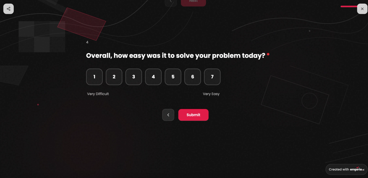
The Customer Effort Score, or CES, measures the friction in one interaction, using a single question:
“How easy was it for you to get your issue resolved?”
Answers sit on a seven-point scale with 1 labeled very difficult and 7 labeled very easy, so you want the score high.
The CES comes from the Corporate Executive Board, a research firm now part of Gartner. In the July/August 2010 issue of the Harvard Business Review, Matthew Dixon, Karen Freeman and Nick Toman laid out the idea in “Stop Trying to Delight Your Customers.” Over three years they had studied more than 75,000 customers who contacted a call center or used self-service. The headline: loyalty comes less from wowing people than from not making them work. When effort was low, 94 percent said they would buy again and a mere 1 percent expected to badmouth the company. When effort was high, 81 percent expected to spread negative word of mouth.
The 2010 version asked “How much effort did you personally have to put forth to handle your request?” on five points, where 1 meant very low effort and 5 very high effort, so the low end was the good end. CES 2.0 later replaced the question with a statement people agree or disagree with on seven points, and our template uses it: “The company made it easy for me to handle my issue.” Whichever newer form you pick, 7 is the low-effort end.
The difference between “easy” and “satisfied”
Friendly and effortless aren’t the same thing. Picture a lovely support rep taking down your new address for the second time, because the app lost it after the first try. You’d praise the rep and still groan about the process. Satisfaction grades the ending, effort grades the trip.
Easy, neutral, difficult: the three ranges
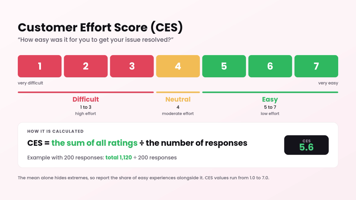
All seven answer options count toward the average. For interpretation, you also group them into three ranges:
- Easy (5 to 7): the customer got it done with little hassle.
- Neutral (4): nothing went wrong, but nothing felt smooth either.
- Difficult (1 to 3): the customer battled forms, hold queues or handoffs.
Where the NPS and the CSAT count shares, the usual CES takes a mean. The good part: every answer moves the needle, so even modest improvements register. The bad part: one 7 plus one 1 averages to 4, exactly like two neutral answers. Report the share of easy experiences beside the mean, always.
Technically, the seven options make up a rating scale with words only at the two ends. Direction is the thing to watch. With 7 as very easy, higher is better. Run the scale the other way, as the 2010 original did with its 1 to 5 effort scale, and a low number becomes the goal.
Tip
The CES tells you where customers hit a wall, not whether they ended up happy. For that part, use the Customer Satisfaction Score. Ask about effort first and satisfaction second after a service contact, and you’ll be able to separate a bad outcome from a bad process.
How to calculate the CES: formula and worked example
You calculate the CES by adding every rating together and dividing that total by how many responses you received. You end up with an average, rounded to one decimal, between 1.0 and 7.0.
- Multiply each rating by its count. That gives the points for every answer option.
- Total the points. Add up the results for all seven options.
- Divide by the number of answers. The result is your CES.
Our free tool will calculate the CES from your counts and break out the easy, neutral and difficult shares too.
The Customer Effort Score formula
CES = sum of all ratings ÷ number of responses
Easy share = responses rated 5, 6 or 7 ÷ total responses × 100
Suppose the bank from the story surveys everyone who replaced a card last month and hears back from 200 of them:
| Rating | Responses | Points |
|---|---|---|
| 7 very easy | 78 | 546 |
| 6 | 42 | 252 |
| 5 | 38 | 190 |
| 4 | 20 | 80 |
| 3 | 11 | 33 |
| 2 | 8 | 16 |
| 1 very difficult | 3 | 3 |
| Total | 200 | 1,120 |
Divide 1,120 points by 200 responses and the CES is 5.6. Of those 200 customers, 158 had an easy time, or 79 percent, and 22 had a difficult one, or 11 percent.
Another bank hits 5.6 too, yet its answers split completely differently: 144 sevens and 56 twos, nothing else. At that bank, more than one customer in four (28 percent) struggled. Identical averages, very different experiences for the people behind them.
Tip
Before you combine CES data from different tools, confirm which end of the scale means easy. Older numbers from a system where 1 stood for little effort would otherwise get flipped, turning a great 2.1 into what looks like a crisis.
What is a good CES score?
Judging a CES starts with knowing your scale. The ranges below assume the 1 to 7 version where 7 means very easy. For a rough orientation, our CES calculator reads scores like this, as a reading aid and not a norm:
- 6.0 to 7.0: very good. Customers barely have to lift a finger.
- 5.5 to 5.9: good. Most breeze through, with a few snags left.
- 4.0 to 5.4: room to improve. A sizable group finds the task tiresome.
- 1.0 to 3.9: critical. Far too many customers have to work too hard.
The card replacement in the example, at 5.6, lands in the good range. The CES gets far more telling when you line up your own processes. Say replacing a card scores 5.6, setting up direct deposit 6.3 and disputing a charge 3.4: the dispute flow is where you start. Measure again after every change and you’ll see whether customers actually noticed.
For US banks, a lot of that effort sits in the app. In the ACSI Finance Study 2026, banks beat credit unions on mobile app performance, while credit unions kept the edge on staff courtesy (ACSI, February 2026). Those are satisfaction ratings rather than effort scores, but they suggest where an effort question does the most good.
Careful
Published CES benchmarks are built on five, seven and even ten point scales, and some of them count backward. There’s no clean way to translate one into another. Hold your CES up only against numbers from the same question and the same scale, and your own history is the best of those.
Create a survey for free
With empirio.ai you can create a modern online survey in minutes — free to start.
- AI-built survey
- Adjust by drag & drop
- Real-time analysis
How to ask the CES question in your survey
Because the CES grades one concrete task, the question goes right where that task ends: the confirmation page after an order, the last screen of an onboarding step, the message that closes a ticket. Ask immediately and people still remember precisely where they got hung up.
Tucked into a long annual survey, the CES loses its footing, because there’s no specific task for people to think of and the answers get fuzzy. It belongs where processes run: the customer portal, the checkout, the tail end of a chat. The Customer Effort Score (CES) template we offer opens with the CES 2.0 statement, followed by a check on whether the problem got solved completely.
Before you send the CES question
- It points to one task or one process only.
- It shows up the moment the task is done.
- Answers run from 1 to 7, with labels on both ends.
- Which end means easy is fixed for good.
- A second question checks that the issue is truly resolved.
- Reports always pair the mean with the share of easy answers.
Tip
When someone answers 1 to 3, show them an open-ended question like “What made this harder than it should have been?” CES follow-ups tend to be strikingly specific, since obstacles stick in memory. Often you’ll hear about the exact field, link or phone menu option that needs changing.
Pros and cons of the CES
Of the three big customer metrics, the CES is the newest and the most practical once your attention turns to processes. It excels at detail and has little to say about the big picture.
What the CES is good at
- It spots friction in individual processes that other metrics overlook.
- In the 2010 study, it beat CSAT and NPS at predicting repurchase in service.
- A weak score usually suggests an obvious fix, such as a shorter form.
- It can be sent automatically whenever a task is completed.
- Because it’s an average, small gains show up right away.
Where the CES comes up short
- It judges individual tasks, not products, prices or your brand.
- Scales and directions vary, so other companies’ numbers rarely match yours.
- An average conceals how many customers really struggled.
- Easy doesn’t equal solved, since a fast rejection can feel effortless.
- Most of the underlying research comes from call centers and self-service.
What the CES can’t tell you
The CES was designed for processes. Stretch it into a verdict on the entire customer relationship and it breaks, because that was never its job.
Three limits deserve attention before the CES becomes the headline number in your service reporting.
The CES can’t tell whether the result was correct
Handling a request quickly and handling it correctly are two different things. Maybe the replacement card was a breeze to order but got mailed to the old address. The CES for that contact shines, and the anger shows up a week later. Pair the effort question with one asking whether the issue was fully resolved.
The CES rates the transaction, not the relationship
In the Harvard Business Review article, the authors credit the strength of the CES to its focus on individual transactions and contrast it with the NPS, which captures a customer’s overall impression. Flip that around and you have the limit: what a customer thinks of your company as a whole stays outside the CES.
The CES average rests on a shaky assumption
An average assumes the gaps between scale points are equal, and nobody can show that going from 2 to 3 means as much as going from 6 to 7. Strictly, the answers only have an order, just like on an ordinal scale. The mean is still practical if you treat it as a general direction and put the full distribution right next to it.
The CES shows you where the road is rough. Whether it leads where your customer needed to go is a separate check.
How the CES differs from other metrics
Two more metrics usually sit beside the CES in customer surveys. They work well together because each one covers a different level:
- The CES captures how much work one task demanded. Use it after checkouts, returns and support tickets.
- The CSAT (Customer Satisfaction Score) captures satisfaction with one experience and comes out as a percentage.
- The NPS (Net Promoter Score) captures how willing people are to recommend your company, standing in for the relationship overall.
For when to use which, and how the three fit together, see our comparison of NPS, CSAT and CES.
Common mistakes in CES surveys
A CES question is set up in minutes, and three avoidable mistakes can drain the value out of it just as quickly. None of them is a math error.
The ground rules for any questionnaire are covered in our 8 tips for the perfect online survey. These three traps are the ones that hit CES surveys in particular.
Asking about the company instead of the task
“Overall, how easy is it to bank with us?” may look like a CES question, but what comes back is a general feeling about the brand. You can’t pin the answers to a process, so you won’t know what to fix. Name the specific task instead, such as ordering a replacement card or changing an address, and keep the question tied to it.
Letting the CES scale flip between rounds
Moving from the original scale, where 1 meant little effort, to the newer one, where 7 means very easy, snaps your time series in two. Record every change to wording or scale and start a new series from that point, rather than plotting old and new numbers on the same chart as if nothing had happened.
Chasing speed instead of solutions
Since the CES is about effort, rushing customers through looks like an easy win. The 2010 study argues the opposite and advises service teams to focus on problem solving, not speed. A short call that ends with the customer having to call back doesn’t cut effort. It doubles it.
Conclusion
The CES answers something the NPS and the CSAT don’t: how much work are you making your customers do? That makes it the sharpest tool for improving processes. Send the question when the task is done, never touch the scale or its direction, put the easy share beside every average and dig into each 1, 2 or 3 you receive. Do that consistently, and the CES will lead you straight to whatever is blocking the way!
Where to go next
- Planning to include the CES in a larger survey? Customer surveys: guide and examples
- Got the answers and need to present them clearly? How to evaluate a questionnaire in five steps
Curious where your customers get stuck?
empirio.ai, an online survey tool from Germany, lets you put together your customer survey in a few minutes and send the link the moment a task is complete. Our CES template already includes the effort statement plus the follow-up questions that belong with it.